

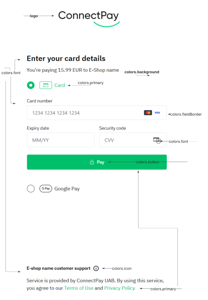
You can customize the appearance of the card payment component to align with your brand identity. This includes changing the logo, colors, and fonts.
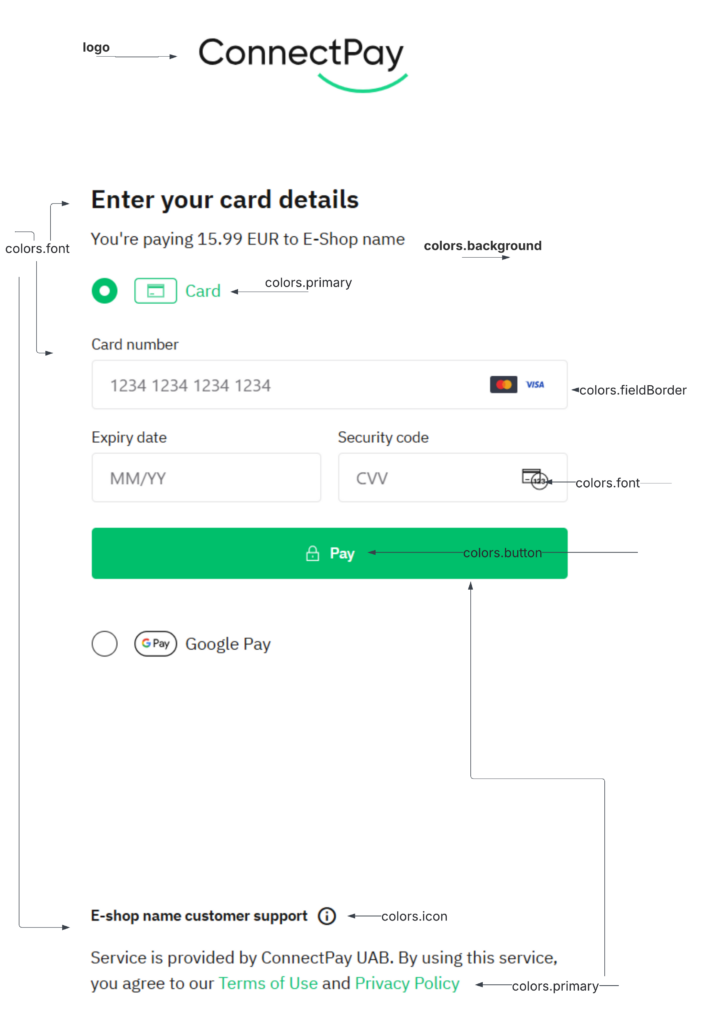
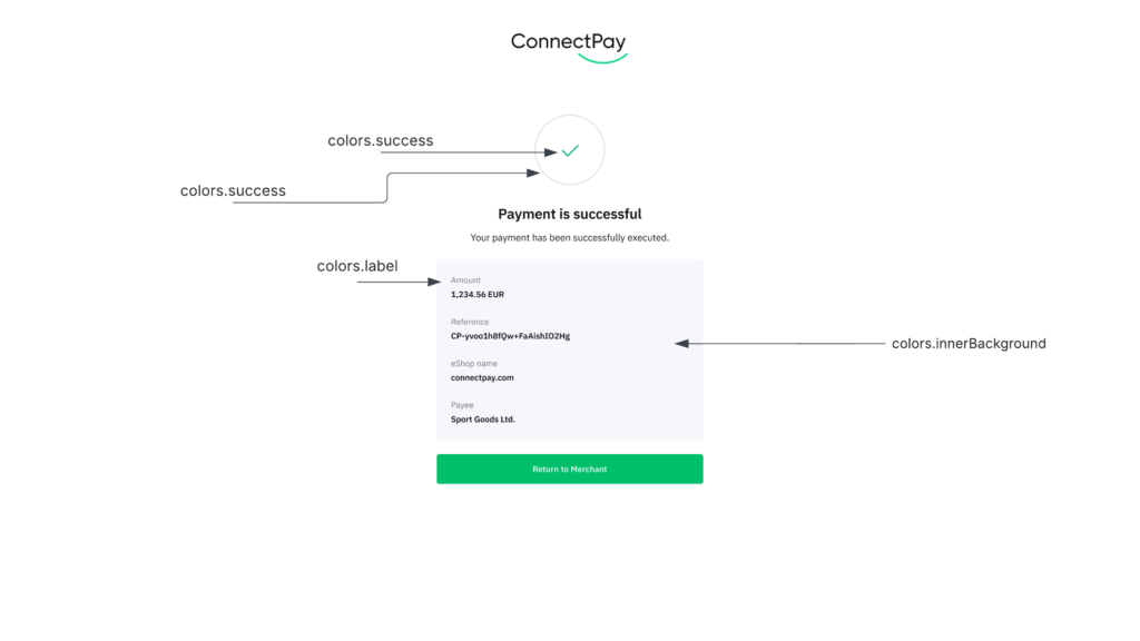
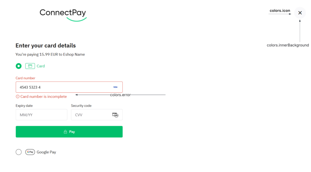
Here is a visual breakdown of the elements you can customize:
1. General Settings
| Parameter | Description | Example Value |
|---|---|---|
themeName | A unique name for your custom theme profile. | "Merchant Brand Theme" |
borderRadius | The corner rounding for input fields and buttons. | "4px" |
borderWidth | The thickness of component borders. | "1px" |
logo | Your brand logo provided as a raw SVG string. | "<svg>...</svg>" |
2. Colors (colors object)
All color values must be provided in HEX format (e.g., #00BF6B).
| Parameter | Description |
|---|---|
background | The main background color of the payment component. |
innerBackground | Background color for nested containers or content blocks. |
primary | The primary accent color for active states and highlights. |
button | The background color for the primary action button. |
font | The primary text color for headers and main body copy. |
label | The color for input field labels. |
metaText | The color for secondary or descriptive text. |
disabledText | The color for text in inactive or disabled states. |
border | General border color for the component. |
fieldBorder | Border color specifically for input fields. |
icon | The color of UI icons. |
success | Color used for successful states and validation. |
error | Color used for error messages and failed validation. |
info | Color used for informational prompts. |
3. Typography (typography & button objects)
You can define separate typography rules for general text and buttons.
| Parameter | Description | Example Value |
|---|---|---|
fontFamily | The name of the font family to be used. | "IBM Plex Sans" |
fontSize | The size of the text (using rem units is recommended). | "1rem" |
fontWeight | The weight of the font (e.g., 400 for regular, 500 for medium). | 500 |
To apply a custom theme, please send a request to our support team at [email protected] with the desired configuration values as specified below.
{
    "themeName": "Test Profile Theme Name",
    "colors": {
        "background": "#FFFFFF",
        "primary": "#00BF6B",
        "font": "#161616",
        "label": "#747378",
        "button": "#FFFFFF",
        "error": "#D62C19",
        "border": "#E3E3E4",
        "fieldBorder": "#E3E3E4",
        "icon": "#161616",
        "success": "#00BF6B",
        "innerBackground": "#F9F9FB",
        "metaText": "#45444B",
        "disabledText": "#E3E3E4",
        "info": "#E3E3E4"
    },
    "typography": {
        "fontFamily": "IBM Plex Sans",
        "fontSize": "1rem",
        "fontWeight": 400
    },
    "button": {
        "fontFamily": "IBM Plex Sans",
        "fontSize": "0.875rem",
        "fontWeight": 500
    },
    "borderRadius": "4px",
    "borderWidth": "1px",
    "logo": "<svg width=\"204\" height=\"76\" viewBox=\"0 0 204 76\" fill=\"none\" xmlns=\"http://www.w3.org/2000/svg\"><path d=\"...\" fill=\"#161616\"/></svg>"
}